26 Best Paint Colors for Media Room That Will Transform Your Viewing Experience!
Ready to transform your media room into the ultimate viewing sanctuary? The right paint color can make all the difference, turning your space into an immersive, comfortable haven that draws you deeper into every movie, show, or game.
Whether you want to create a cozy, dark retreat or a stylish, modern vibe, choosing the perfect shade is key to enhancing your experience. You’ll discover 26 of the best paint colors that not only look amazing but also boost the quality of your viewing environment.
Keep reading to find the perfect color that will elevate your media room and change the way you enjoy entertainment forever!
Top Dark Shades
Black creates a strong sense of depth in any media room. It absorbs light well, reducing glare and enhancing the clarity of your screen. This color helps focus attention on the visuals without distractions.
Charcoal gray offers a softer alternative to black. It still controls light reflection, but gives a warmer, cozy feel. This shade pairs well with bold decor and adds subtle elegance.
Navy blue brings a rich, luxurious touch to the space. It reduces eye strain and creates a calm, inviting atmosphere. Navy works well with both modern and traditional styles.
Cool Gray Tones
Light gray creates a soft and calm atmosphere. It reflects some light, keeping the room bright. It works well if your media room has little natural light. Dark gray offers a cozy, theater-like feel. It absorbs light, reducing glare on the screen. This color is perfect for intense movie watching.
Gray’s neutral tone fits many styles. It does not compete with screen colors. This makes gray a favorite for media rooms. You can easily change accents without repainting the walls.
Pair gray walls with bright accent colors like red, yellow, or blue. These accents add energy and style. Dark gray walls look great with metallic or neon accents. Light gray pairs well with soft pastels or wood tones.
Bold Color Choices
Deep green creates a calm yet rich atmosphere for media rooms. It helps reduce glare and makes screens easier to see. This color also adds a touch of nature and freshness without being too bright.
Rich burgundy gives a warm and cozy feeling. It makes the room feel inviting and perfect for long movie nights. This color pairs well with dark furniture and soft lighting to enhance the viewing experience.
Moody purple offers a unique and creative vibe. It adds depth and a sense of luxury. This color works great with dim lighting and can make your media room feel special and different from other rooms.
Warm And Inviting Colors
Earthy browns and tans create a cozy, grounded feeling in a media room. These colors absorb light, reducing glare and making screens easier to see. Shades like chocolate brown or warm tan add richness without being too dark.
Soft beige and creams offer a warm, inviting vibe that feels light and airy. They work well in rooms with less natural light, brightening the space while keeping it calm. These shades also blend nicely with many furniture styles.
Subtle warm reds add a gentle pop of color without overwhelming the room. Think of muted brick or rust tones. These colors add warmth and energy, making the space feel comfortable yet vibrant.
Accent Wall Ideas
Behind the screen colors should be dark and matte. Black or deep charcoal helps absorb light. This reduces glare and improves picture quality. Dark navy or forest green also work well to create a cozy feel.
Complementary side walls can be lighter or muted tones. Soft grays, warm taupes, or dusty blues balance the dark accent wall. These colors keep the room calm without distracting from the screen. They also add depth to the space.
Textured and patterned paint adds interest without bright colors. Consider subtle stripes, sponging, or matte finishes. These effects reduce sound reflection and improve acoustics. Use gentle textures on side walls to keep focus on the screen.
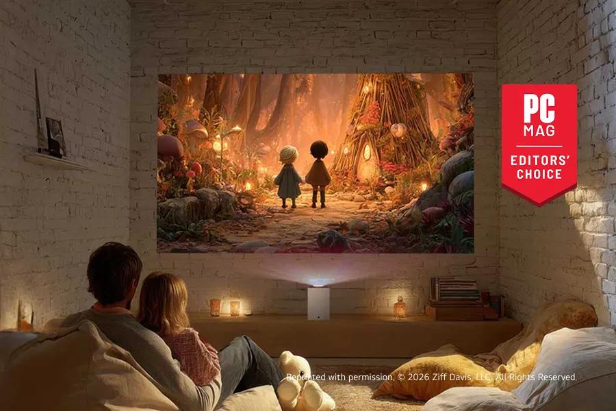
Credit: www.lg.com
Light Reflectance And Room Size
Small rooms need lighter paint colors to feel open and airy. Light colors like soft grays, pale blues, or warm whites reflect more light, making spaces look bigger. Avoid dark shades in small rooms because they can make the space feel cramped and smaller.
For large rooms, darker colors work well by adding coziness and reducing empty space feeling. Deep blues, charcoal grays, or even black can make big rooms feel warm and inviting. Using darker tones helps absorb light and reduces glare during movie time.
Balancing light and dark tones creates the perfect atmosphere. Combine a dark accent wall with lighter surrounding walls. This mix controls light reflectance and gives depth without overwhelming the room. Proper balance improves viewing comfort and enhances the media experience.
Matte Vs Glossy Finishes
Matte finishes are perfect for media rooms because they reduce glare. They absorb light instead of reflecting it. This helps keep the screen clear and easy to watch.
Satin and eggshell finishes offer a slight shine but still minimize reflections. They are a good choice if you want a little sheen without too much glare.
Avoid glossy surfaces in media rooms. Glossy paints create bright spots and reflections that distract from the screen. These reflections make it hard to enjoy movies or games.
| Finish Type | Benefits | Best Use |
|---|---|---|
| Matte | Low glare, hides imperfections | Media rooms, home theaters |
| Satin/Eggshell | Soft sheen, moderate glare control | Media rooms with some light |
| Glossy | High shine, reflects light | Not recommended for media rooms |
Credit: www.houseandgarden.co.uk
Color Pairings For Media Rooms
Combining dark and light shades creates a perfect balance in media rooms. Dark colors like deep blue or charcoal help reduce glare and improve screen visibility. Light shades such as soft gray or beige brighten the space without overwhelming it.
Using bold colors with neutrals adds energy without distraction. For example, a bold red or navy accent wall paired with neutral gray or cream walls can bring life to the room. Neutrals keep the space calm and allow the bold color to stand out.
Creating visual interest means mixing textures and finishes. Matte paint reduces shine and is best for walls near screens. Glossy finishes can be used on trims or doors to add subtle contrast. Layering these elements keeps your media room inviting and stylish.
Popular Paint Brands And Colors
Sherwin-Williams offers popular colors like Iron Ore, a deep charcoal perfect for media rooms. Tricorn Black provides a rich, true black that reduces glare and enhances screen contrast. Urbane Bronze adds a warm, dark tone that feels cozy without being too dark.
Benjamin Moore features favorites such as Wrought Iron, a strong black that absorbs light well. Kendall Charcoal is a medium gray that balances dark and light. Hale Navy brings a bold, dark blue that adds style and depth.
Other trusted brands include Behr’s Blackout, a deep black shade, and Farrow & Ball’s Railings, a dark blue-black with a slight sheen. These colors help create a perfect environment for watching movies.
Tips For Painting Your Media Room
Start by cleaning walls to remove dust and dirt. Patch any holes or cracks for a smooth surface. Sand rough areas lightly to help paint stick better.
Use quality brushes and rollers suited for your wall type. A roller covers large areas fast, while brushes help with corners and edges. Keep tools clean for the best finish.
Apply at least two coats of paint for rich color and durability. Let each coat dry fully before adding the next. Thin layers prevent drips and uneven spots.
:max_bytes(150000):strip_icc()/TAL-header-exterior-carversville-inn-CARVERSVILLEINN0426-16c8194d32f54182a49386016e812b1f.jpg)
Credit: www.travelandleisure.com
Frequently Asked Questions
What Is The Best Paint Color For A Media Room?
The best paint colors for a media room are dark shades like black, charcoal gray, or navy blue. These colors absorb light and enhance screen contrast. They create an immersive viewing experience by reducing glare and minimizing reflections, making visuals pop effectively.
What Is The Most Popular Color For A Sunroom?
White is the most popular sunroom color. It reflects natural light, brightens the space, and complements any decor style. Creamy whites like Alabaster and Marshmallow are top choices for a warm, inviting sunroom.
What Colors Are Good For Media Walls?
Good colors for media walls include dark shades like black, charcoal gray, and navy blue, which reduce light reflection. Neutral tones such as white, gray, and beige also work well, creating calm, balanced spaces. These colors enhance visual focus and improve the viewing experience.
What Colors Inspire Creativity In A Room?
Colors like red, orange, deep purple, and coastal blue inspire creativity by energizing and stimulating the mind in a room.
Conclusion
Choosing the right paint color sets the mood for your media room. Dark shades like navy, charcoal, and black reduce glare and enhance picture quality. Lighter tones can create a calm and inviting space without distracting from the screen. Consider your room’s lighting and furniture when picking colors.
The perfect paint makes every movie or game more enjoyable. Start with these 26 best paint colors to transform your viewing experience today. Your media room deserves a fresh, stylish look that fits your style and comfort.